A quick run through of how various GNOME terminal palettes look like with the 8-color+bold DIR_COLORS file shipped with coreutils and used by many Linux distributions.
Tango is a fairly light value but low saturation palette. The light background is an odd off-white shade that reduces contrast. When the “Show bold text in bright colors” option is enabled, bright cyan and bright green over the light background have minimal contrast. When using a dark background, the palette gives reasonable results, but the highly saturated red as used in archive files is problematic.
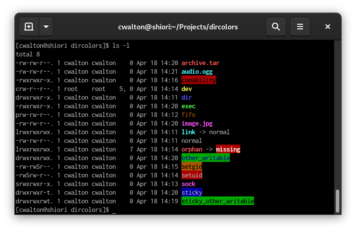
The contrast of blue over green used in the “other_writable” directory is very low.

Disabling the bright-is-bold option improves the contrast in light mode, but in dark mode the dark red, blue, and purple colours are now too close to the background color.
XTerm and Rxvt palettes are very similar; the main difference is that Xterm has a lighter, lower saturation bright blue. A real VGA console does not support bold text at all.
The Xterm palette suffers from bright cyan and green being nearly unreadable on the white background. The VGA palette is quite good, it appears that the default DIR_COLORS may have been optimized for the VGA palette specifically. The fifo is a bit low contrast due to the dark orange/brown shade, and the bright blue for directories is still a bit low contrast against the black background.
The current revision of the new GNOME palette is a compromise between the Tango and Xterm palettes. The lighter background colour in light mode improves contrast over Tango, while disabling the bold-is-bright option means the green is ok, and the cyan is, well, still not great. Contrast for the blue-on-green used for “other writable” directories is improved over Tango.
Dark mode with the new palette suffers a bit. Despite using a darker background than Tango, the dark red and blue colours remain very low contrast. The dark purple is a bit better than Tango. Enabling the “Show bold text in bright colors” option works around these issues.
Proposed modifications to DIR_COLORS
When used with the stock 8-colors + bold DIR_COLORS file that many Linux distributions use (and is shipped with coreutils), the new GNOME palette has better contrast than Tango in the light mode. The dark mode is about the same.
To improve dark mode in GNOME terminal with the “Show bold text in bright colors” option disabled, distributions should modify the DIR_COLORS file to use 16-colour terminal escapes to explicitly select the bright colors rather than relying on bold colors being shown as bright. I recommend making the following changes:
Replace the values “31”, “34”, “35”, and “37” with the values “91”, “94”, “95”, and “97” in all locations except OTHER_WRITABLE. This change causes the bright versions of Red, Blue, Purple, and White to be used as foreground colors.
The CAPABILITY, STICKY_OTHER_WRITABLE, and OTHER_WRITABLE file types use a dark foreground color. To improve contrast, a brighter background color can be selected: change “41” and “42” to “101” and “102” on these entries.
The FIFO and DEVICE types explicitly set a dark background, so using bright foreground helps improve contrast: change “33” to “93” on both entries.
CAPABILITY is pretty terrible in all colour palettes. Changing the background to purple rather than red allows it to have a white foreground, like SETUID. Use “97;45”
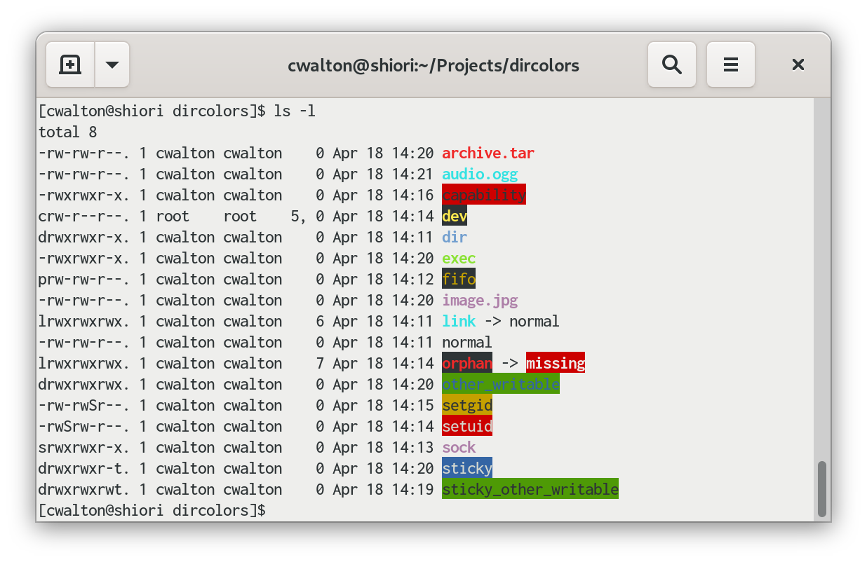
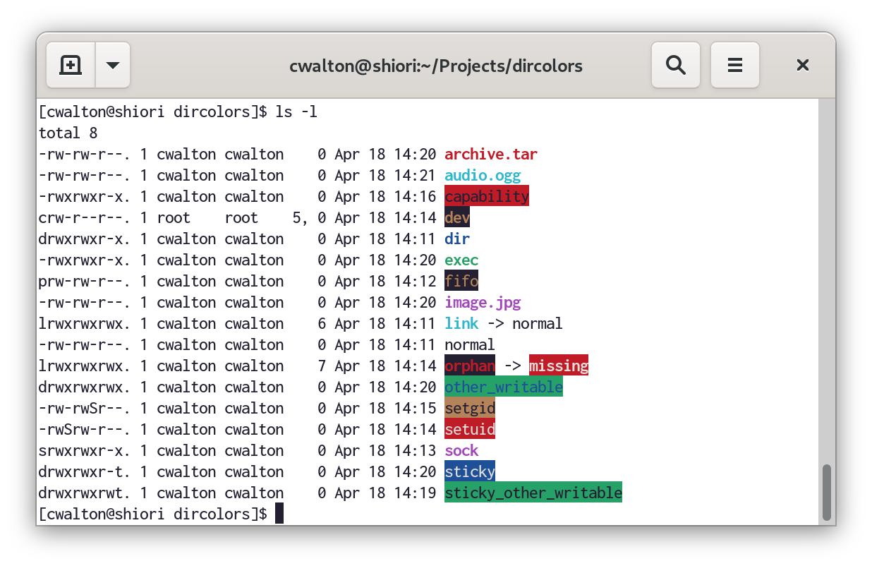
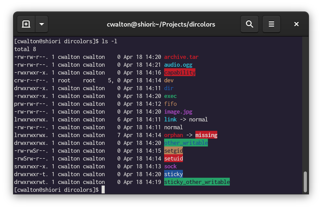
The result looks like this:
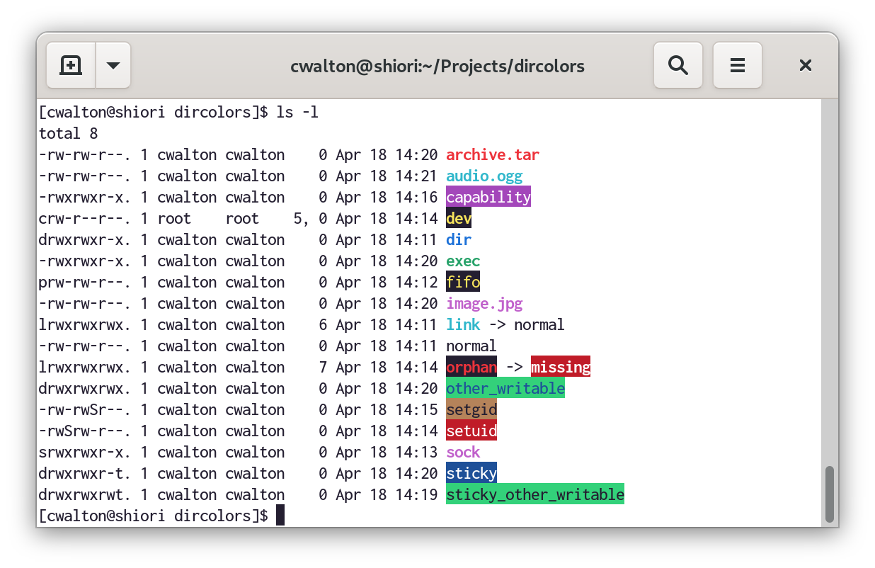
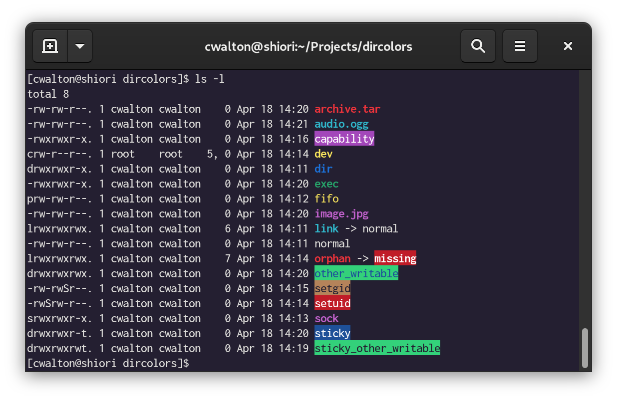
The brighter blue, red, and purple remain readable on a light background, and improve contrast on the dark background.
WCAG results for the new GNOME palette
These results assume the DIR_COLORS contrast improvements have been applied. Note that for places where bold text is used, I’m using the “Large text” contrast guidelines if the colors failed the normal text check. Spots where this was done are marked.
| File Type | Colours | WCAG (Light background) | WCAG (Dark background) |
|---|---|---|---|
| Normal | No color code | AAA | AAA |
| Directory | Bold Bright Blue | AA | AA (Large text) |
| Link | Bold Dim Cyan | Fail | AA |
| Fifo | Bright Yellow over Dim Black | AAA | AAA |
| Socket | Bold Bright Purple | AA (Large Text) | AA (Large text) |
| Device | Bold Bright Yellow over Dim Black | AAA | AAA |
| Orphan | Bold Bright Red over Dim Black | AA (Large text) | AA (Large text) |
| Missing | Bold Bright White over Dim Red | AA | AA |
| SETUID | Bright White over Dim Red | AA | AA |
| SETGID | Black over Dim Yellow | AA | AA |
| Capability | Bright White over Dim Purple | AA | AA |
| Sticky, Other writable | Dim Black over Bright Green | AAA | AAA |
| Other writable | Dim Blue over Bright Green | Fail | Fail |
| Sticky | Bright White over Dim Blue | AAA | AAA |
| Executable | Bold Dim Green | AA (Large text) | AA |
| Archive | Bold Bright Red | AA (Large text) | AA (Large text) |
| Image | Bold Bright Purple | AA (Large text) | AA (Large text) |
| Media | Bold Dim Cyan | Fail | AA |
I don’t think there’s much room to improve this more without using separate DIR_COLORS configurations for dark vs. light backgrounds. Changing the palette to reduce the brightness of Dim Cyan would improve the contrast of some file types with a light background, but it would hurt other applications that rely on Dim Cyan being readable over a Dim Blue background.
Leave a Reply